#Installs the package on your system.
install.packages(c("tidyverse", "gapminder"))
Warning: packages 'tidyverse', 'gapminder' are in use and will not be installed#load the libraries so you can use them
library(tidyverse)
library(gapminder)
Welcome to the first iteration of the Humans Learning lessons. If you are here then you are interested in learning something about data analysis through code. Each lesson is designed as a 5 - 10 minute virtual session conducted for EnCompass staff to expand their skills with data, and the means of learning is the R programming language. Each lesson will have learning objectives, some example code and explanation to demonstrate a technique or skill, and an open code chunk at the end for you to have some fun. Each lesson is captured in an html file for online access. This is all in the service of humans learning. Enjoy!
For this first course, the learning objectives are to:
Install and load the tidyverse and gapminder packages in your RStudio console
Make your first plot
In your R script, you will use the install.packages() and library() functions to install and load the two packages Tidyverse and Gapminder.
Tidyverse provides a suite of compatible data wrangling and visualization tools. Gapminder provides a dataset extracted from the global trend data maintained by, https://www.gapminder.org/.
#Installs the package on your system.
install.packages(c("tidyverse", "gapminder"))Warning: packages 'tidyverse', 'gapminder' are in use and will not be installed#load the libraries so you can use them
library(tidyverse)
library(gapminder)Now that you have completed the first step it is time to view the data. To look at just the first six rows so you can see the variable names and structure of the data pass gapminder to head() as in the code below.
#look at the gapminder dataset
head(gapminder)
# A tibble: 6 × 6
country continent year lifeExp pop gdpPercap
<fct> <fct> <int> <dbl> <int> <dbl>
1 Afghanistan Asia 1952 28.8 8425333 779.
2 Afghanistan Asia 1957 30.3 9240934 821.
3 Afghanistan Asia 1962 32.0 10267083 853.
4 Afghanistan Asia 1967 34.0 11537966 836.
5 Afghanistan Asia 1972 36.1 13079460 740.
6 Afghanistan Asia 1977 38.4 14880372 786.To make it even easier to work with, you can assign gapminder to the object df. Now you only have to type df to see it. You can view only the variable names by passing df to names().
#make gapminder an object
df <- gapminder

#read variable names
names(df)
[1] "country" "continent" "year" "lifeExp" "pop" "gdpPercap"As fun as looking at data is, we probably want to do more. So, we should make our first plot using ggplot(). The structure of ggplot requires that we pass it an object (df), the type of geom_* we want to make (in this case a scatterplot), and the aesthetics or the variables we want to plot. The code below provides a first plot.
Then we make the plot an object.
#make a plot
ggplot(data = df) +
  geom_point(aes(x = gdpPercap, y = lifeExp, color = continent)
, alpha = .4) 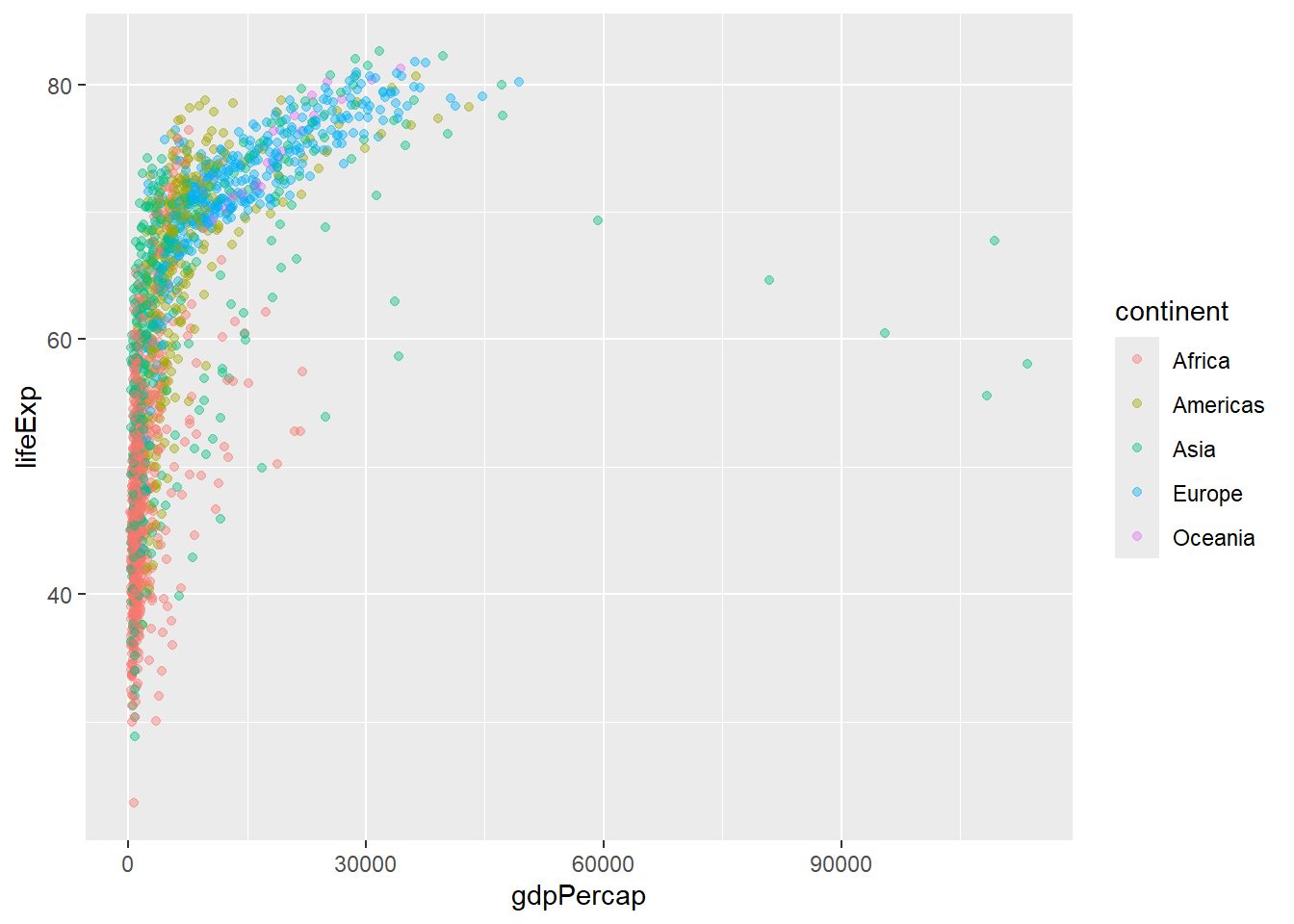
#make the plot an object
plot <- ggplot(data = df) +
  geom_point(aes(x = gdpPercap, y = lifeExp, color =  continent)
             , alpha = .4)
This next plot does a little more by adding to the plot object. We rescaled the data to correct for some outliers and we added a smoothing line to help readers interpret the trend easily.
#use the object to add more things to the plot
plot +

  #rescale data
  scale_x_log10() +

  #add a smoothing line
  geom_smooth(aes(x = gdpPercap, y = lifeExp))
`geom_smooth()` using method = 'gam' and formula = 'y ~ s(x, bs = "cs")'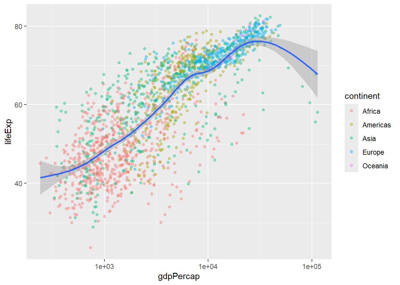
Now it’s your turn practice! Below is a fully functioning code editor with starting code in place. Try changing the variables or changing the type of chart from a scatter plot (geom_point()) to a line graph (geom_line()) or a bar graph (geom_col() or geom_bar()).