#Installs the package on your system.
install.packages(c("tidyverse", "gapminder"))
Warning: packages 'tidyverse', 'gapminder' are in use and will not be installed#load the libraries so you can use them
library(tidyverse)
library(gapminder)
Greetings and welcome to the third iteration of Humans Learning. As a reminder, each lesson is designed as a 5 - 10 minute virtual session conducted for EnCompass staff to expand their skills with data, and the means of learning is the R programming language. Each lesson will have learning objectives, some example code and explanation to demonstrate a technique or skill, and an open code chunk at the end for you to have some fun. This is all in the service of humans learning. Enjoy!
For this session, the learning objectives are to:
Understand ggplot’s facetting function to make multiple plots at once
Make a facetted plot
In your R script, you will use the install.packages() and library() functions to install and load the two packages Tidyverse and Gapminder.
Tidyverse provides a suite of compatible data wrangling and visualization tools. The workhorse of data visualization is the ggplot2 package. With ggplot2 the sky is the limit! From basic bar plots to animated graphics to interactive charts and tables connected by a common data source, ggplot2 and its extension packages can do it all. And once again, Gapminder provides a dataset extracted from the global trend data maintained by, https://www.gapminder.org/.
#Installs the package on your system.
install.packages(c("tidyverse", "gapminder"))Warning: packages 'tidyverse', 'gapminder' are in use and will not be installed#load the libraries so you can use them
library(tidyverse)
library(gapminder)Similar to before, we need to ensure we have the data and that it’s in a format that we can use. To look at just the first six rows so you can see the variable names and structure of the data pass gapminder to head() as in the code below.
# assign gapminder to df
# this is required, but it makes life easier
# don't we all want life to be easier

df <- gapminder

# look at the gapminder dataset
head(df)
# A tibble: 6 × 6
country continent year lifeExp pop gdpPercap
<fct> <fct> <int> <dbl> <int> <dbl>
1 Afghanistan Asia 1952 28.8 8425333 779.
2 Afghanistan Asia 1957 30.3 9240934 821.
3 Afghanistan Asia 1962 32.0 10267083 853.
4 Afghanistan Asia 1967 34.0 11537966 836.
5 Afghanistan Asia 1972 36.1 13079460 740.
6 Afghanistan Asia 1977 38.4 14880372 786.tail(df)# A tibble: 6 × 6
country continent year lifeExp pop gdpPercap
<fct> <fct> <int> <dbl> <int> <dbl>
1 Zimbabwe Africa 1982 60.4 7636524 789.
2 Zimbabwe Africa 1987 62.4 9216418 706.
3 Zimbabwe Africa 1992 60.4 10704340 693.
4 Zimbabwe Africa 1997 46.8 11404948 792.
5 Zimbabwe Africa 2002 40.0 11926563 672.
6 Zimbabwe Africa 2007 43.5 12311143 470.It look pretty clean and tidy. We’ll explore some additional options for looking at data sets in the coming weeks.
We’ve used ggplot2 in the previous lessons so this will seem quite familiar. The structure of ggplot requires that we pass it an object (df), the type of geom_* we want to make (in this case a line plot), and the aesthetics (the variables we want to plot).
We can start with the plot from lesson two and assign it to the object, plot.
#set up the data like last time
df1 <- df |>
  group_by(continent, year) |>
  summarize(avg_gdpPercap = mean(gdpPercap))
`summarise()` has grouped output by 'continent'. You can override using the
`.groups` argument.#make a plot
plot <- ggplot(df1) +
geom_line(aes(x = year, y = avg_gdpPercap, color = continent))That gives us the same line plot as last session.
Facetting will separate each of this lines into their own plot panel. You can imagine that if you have lots of data on a single plot, it is easier to see if you can separate visualizations by one of the discrete variables.
Below, the data is separated by continent. Note that the axes across each plot panel are the same which allows for comparison. This is a default of the facet_wrap() function. There are cases where you would want to set this feature to false, but in most cases it allows for obvious comparisons across the data.
#| class-output: pre


plot +
  facet_wrap(facets = df1$continent)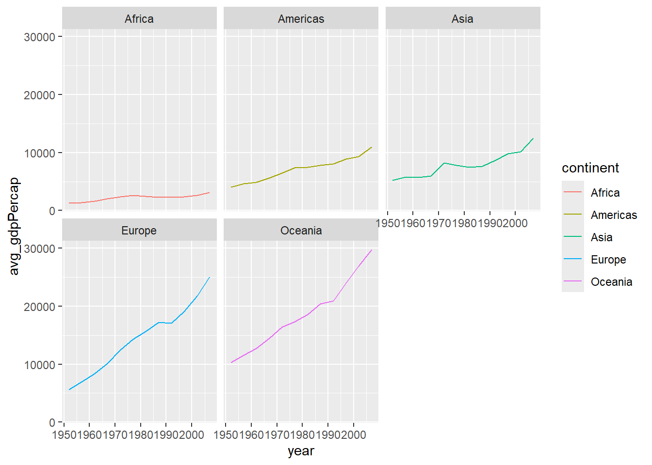
Here’s another example that takes the data for one continent and facets it by country.
First, we do a little data wrangling. Then, we plot.
#| class-output: pre

#Filter
df2 <- df |>
  filter(continent == "Americas") |>
  group_by(country, year) |>
  summarize(avg_gdpPercap = mean(gdpPercap))
`summarise()` has grouped output by 'country'. You can override using the
`.groups` argument.#| class-output: pre
plot_amer <- ggplot(df2) +
geom_line(aes(x = year, y = avg_gdpPercap, color = country)) +
labs(title = "Standard Plot") +
theme(legend.position = "none")
plot_amer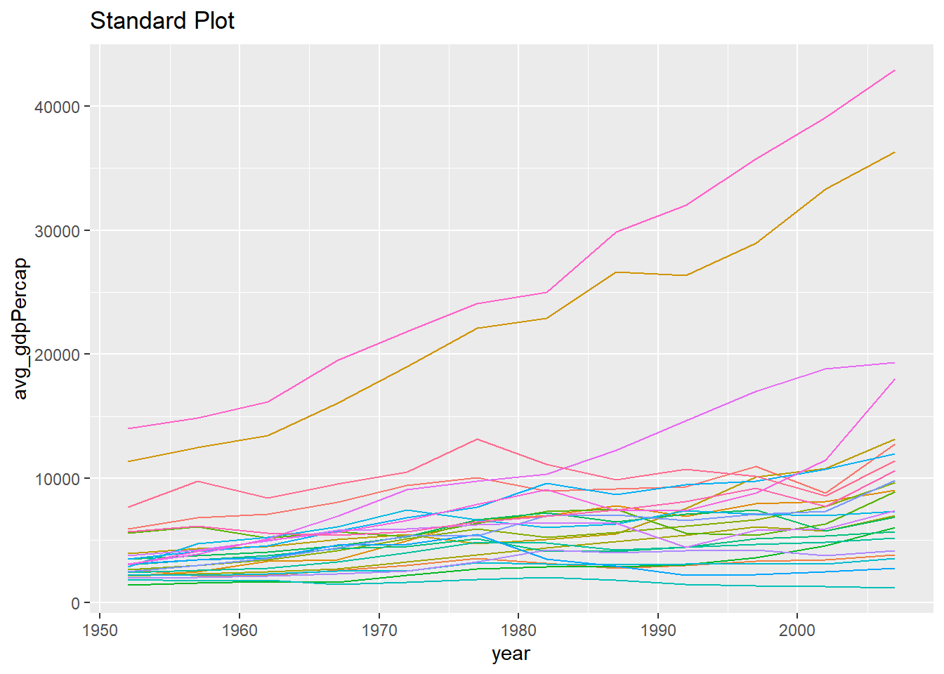
plot_amer +
  facet_wrap(facets = df2$country) +
  labs(title = "Facetted Plot") +
  theme(legend.position = "none"
        , axis.text.x = element_text(angle = 45, vjust = .5, hjust = 1))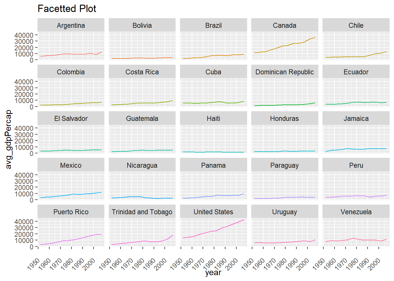
Now it’s your turn practice! Below is a fully functioning code editor with starting code in place. Feel free to experiment with different grouping variables in the group_by() call or to adjust the summary statistic in summarize(). Then, have fun with the plot!